A little color...
I'm forcing myself to get out and work in color, if only to get a little more comfortable with water media. The color itself isn't the problem-- I've painted in oils so long that I'm fairly confident in terms of what I see color-wise. It's just that watercolors are the exact opposite of oil paint. Oil is forgiving. You can add or subtract easily to cover up your mistakes, and you can mix right there on the canvas. Watercolor requires a lot more discipline, and I just haven't gotten there yet. We'll see...
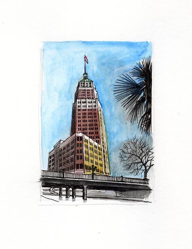

These still look really good! What size brush are you using? I find that using a bigger brush, esp for large areas like skies results in less visible brush strokes. And, also mixing up a lot of color so you don't have to stop in the middle to mix more is helpful.
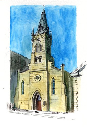
ReplyDeleteHey I like the watercolor a lot. Which church is this?
ReplyDeleteThanks y'all. Carolyn, I was using a small waterbrush (I only had one size on me) so you can see how I would have trouble with large color fields. That and it's hard to mix up a bunch of color with the waterbrush because the water comes from inside the brush. It's a tricky tool, though I've seen others get good results, so I'll keep at it. Theailurophile, this is St. Joseph's Catholic Church here in S.A., known locally (and affectionately) as St. Joske's. When the Joske's dept. store expanded in the '20s or '30s, the Church wouldn't move, so they built the store around the church on three sides. I think i's beautiful and very German-looking.
ReplyDeleteIt won't take you long. Not at all. These are both great, Paul.
ReplyDelete